It’s time to cover up the red walls in your dining room and give your space a clean, smooth look. Not only are we going to help you pick out the Best Greige Paint Colors (greige + beige) for your space, we are also going to give you some helpful tips that will save you lots of time while doing it!
What is Greige + Where to Paint It?
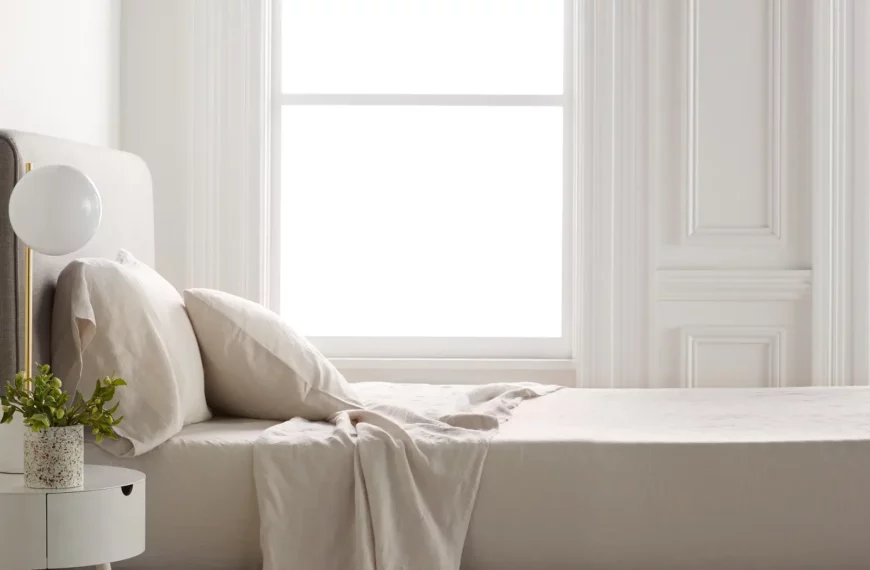
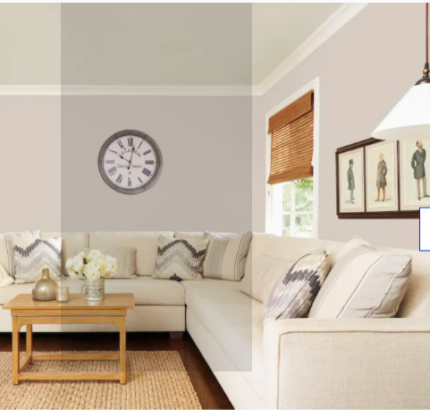
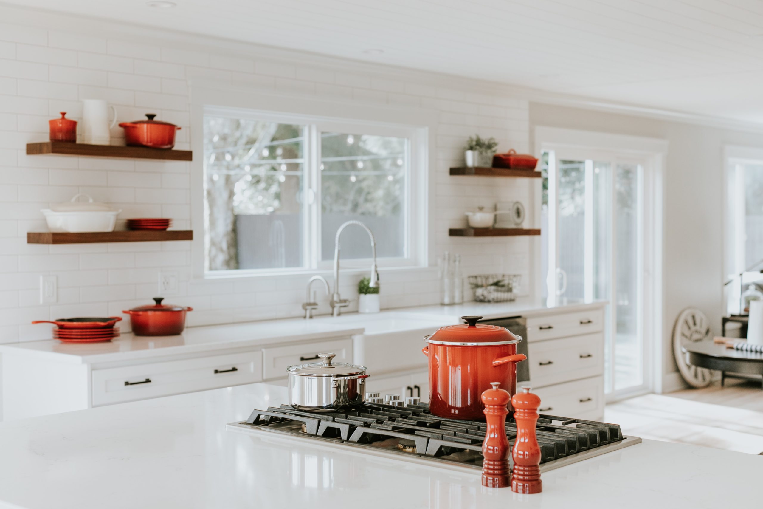
Not only is it a clean slate that compliments almost every design taste, greige also is a great mood stabilizer and instantly brings down the temperature in any space. For this reason, we recommend using greige, especially in high-traffic areas, such as the living room and dining room, and also spaces that you go to de-stress (such as the bedroom).
Greige & Home Decor
Since greige is so versatile and each brand makes there’s a little different, here are some quick style tips that will help your space look the best it can be:
For a more earthy, rustic feel: If you would say that your design taste closely matches that to the rustic outdoors, then greige is a great pick for you! One of the ways that you can make the most of this resourceful color is to pair it with some warm accent pieces.
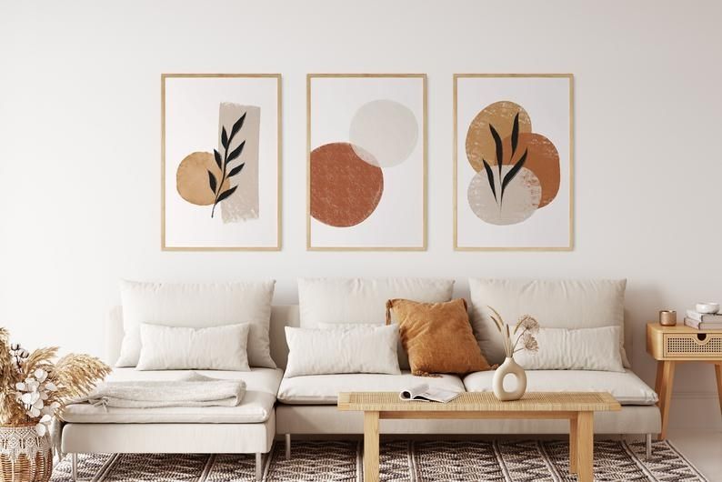
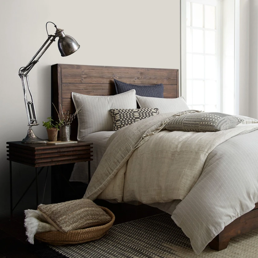
We highly recommend complimenting your greige walls and/or ceilings with neutral-color furniture (wooden is even better!), especially if you are using greige in a dining room or living room. Wooden dining tables, light cream couches, bronze wall sconces and art does so much to bring out the earth undertones in a lighter greige and also ground the room.
Darker greige colors, such as Mole’s Breath by Farrow & Ball would look really sharp paired with a color scheme that mimics the natural world (think blues, greens, tans, etc). Furniture such as an accent rug, end tables, and statement pieces help bring your space a pop of color. Going even further, botanical art paired with a statement chandelier and lots of plants will make your space look, and feel like, an indoor oasis.
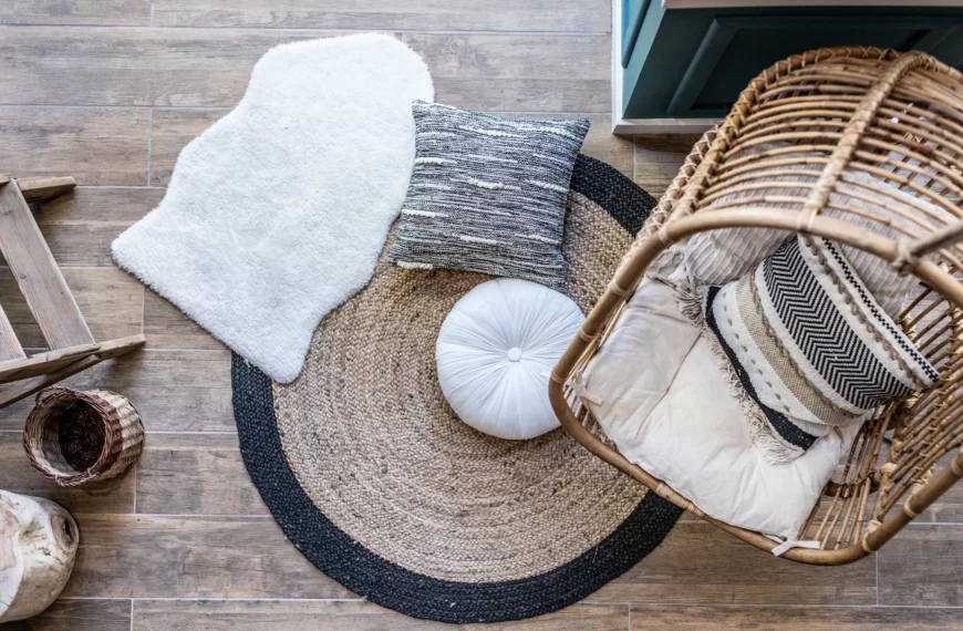
Boho: More of the boho type? Greige is a great paint color to go with if you love bohemian decor. Lighter greige hues are the perfect choice for if you want to go with more statement pieces, such as a leather couch, unique art pieces, colorful furniture . Add some ratan and your space is guaranteed to feel like an earthy, boho paradise!
While these are two of the most popular design tastes that are commonly paired with greige paint colors, as you dig into our recommendations you will see that the options are literally endless with this color MVP. It’s hard to find a design style that doesn’t look good with greige (trust me, we’ve tried)!
Thinking you need some greige in your space? Take a look at these 18 gorgeous greige paint colors, including our top 2 picks, to find the hue that works perfect for you.
18 Best Greige Paint Colors
Yarn | Magnolia
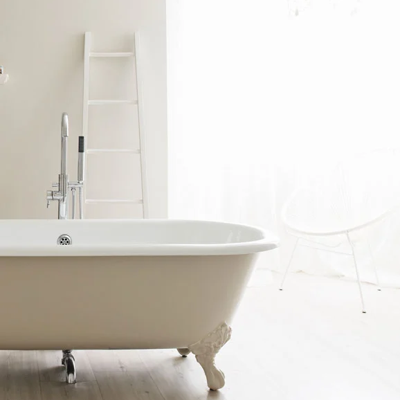
The Gaines’ do it again in bringing to you all the joy and versatility of greige in Yarn. Perfect for any bedroom, lounge space, or dining room; you are sure to feel instantly relaxed the second you walk into the room.
Edgecomb Gray | Benjamin Moore
If you are looking for a more neutral, organic greige, Edgecomb Gray is definitely for you! It’s subtle warm undertones and natural earth hues instantly evoke feelings of peace and serenity. This is a great option for those looking for a lighter greige.
Design Tip: This color would look great with some colorful accent pieces. Pair with a velvet couch and a faux fur rug for a more eclectic vibe.
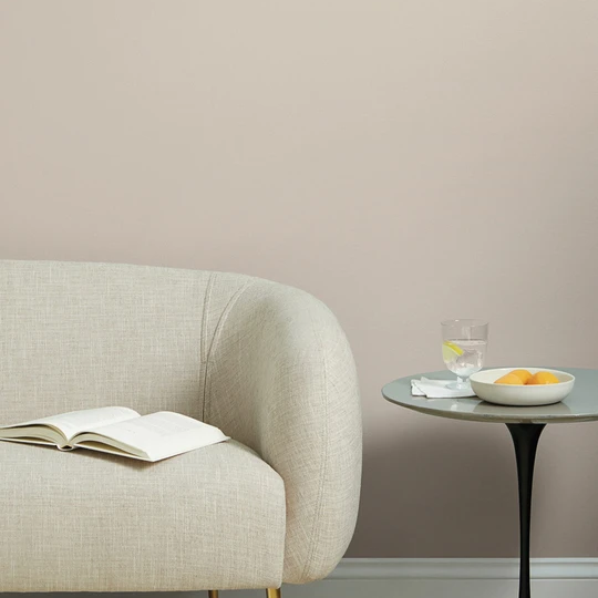
Taupe | Graham & Brown
Perhaps my all-time favorite greige, Taupe boasts smoky, dark-earth tones that are perfect for making a space feel both sophisticated and relaxed.
And the best part? It also comes in outdoor paint, to ensure that you can feel as relaxed and close to nature out on your porch as you do inside your living room (or wherever else you choose to use this fabulous color).
Design Tip: This greige would look amazing when paired with an industrial design.
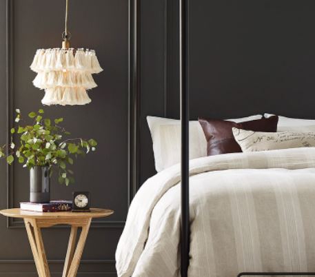
Elephant’s Breath | Farrow & Ball
If you read my other piece on paint colors, you know that I am a huge fan of Farrow & Ball paints. Not only do they make unique colors that you won’t find anywhere else, but their paints also stand the test of time (and messy kids. And pets. And spouses).
Elephant’s Breath, one of their iconic greige paints, was originally named after John Fowler, a notable English designer. What makes this greige different from all the rest is its subtle undertones of magenta, that when painted in a west-facing room with lots of natural sunlight, can almost look lilac.
Flatiron | Clare
Can’t decide whether to go with a light or dark greige? Why not go with both? Clare’s Flatiron, which looks light during the day, slowly starts to get darker as night approaches.
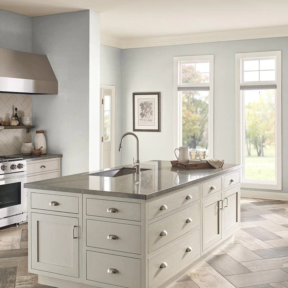
Silver Ash | Behr
Almost white, Silver Ash is one of the lightest greige paints you can find.
Design Tip:We especially like this one in spaces that may already seem busy, like a kitchen or bathroom.
RELATED: 14 Colors that Go Perfectly with Purple
Charleston Gray | Farrow & Ball
Can you think of a more earthy, organic paint color? Charleston Gray is as sophisticated, warm and rich as the city it’s named after.
Design Tip: Pair with bronze undertones and lighter wood or leather accent pieces to unify the space.
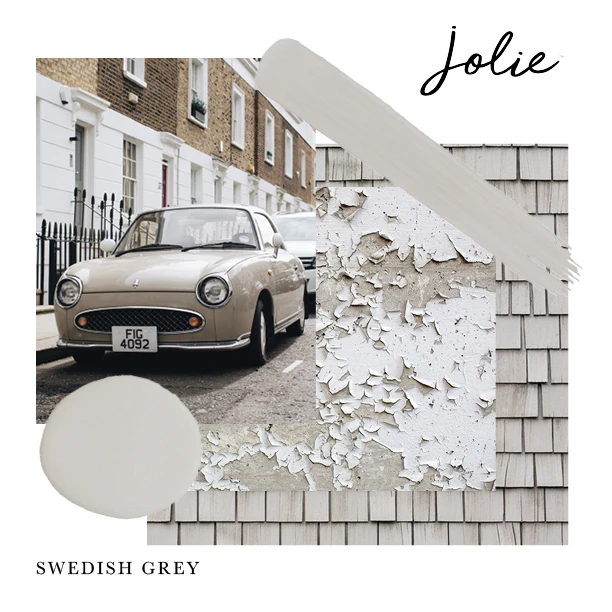
Swedish Gray | Jolie Paint
A muted grey featuring soft, cream undertones.
Design Tip: This paint is an especially great choice for anyone looking to redo their furniture, as many customers loved how their dressers, bed frames, and cabinets turned out after painting them with Swedish Gray.
Sentimental Gray | Backdrop Home
Similar to Taupe, Sentimental Gray is a warm, taupe greige. What makes them different? Sentimental Gray is a couple of hues lighter and features just a little more brown (which can make a huge difference).
Design Tip: This color works great in spaces that already have earthy undertones, like hardwood floors, bronze furnishings, plants, etc.
Rubine Ashes | Little Green Paper & Paint
For all the lavender fans out there. This English-made hue features a darker greige hue with a hint of lavender--bringing all the beauty of an English garden to your home.
Paris Gray | Annie Sloan
A gorgeous muted greige with soft, blue undertones.
Design Tip: This greige works especially well when paired with a teal, green, blue, burgundy or black/white color scheme.
Shuttleworth | Graham & Brown
It’s time to lighten things up a bit! Shuttleworth features an elegant combination of light grey with just a whisper of beige.
Classic | Clare
The name truly says it all.
Anew Gray | Sherwin Williams
For a more sandy, beach-like feel. Chairs and magazines not included.
Revere Pewter | Benjamin Moore
One of Benjamin Moore’s most popular colors, Revere Pewter presents a classic, medium-toned greige that couldn’t be more elegant or versatile.
Agreeable Gray | Sherwin Williams
It was easy to include Agreeable Gray because my home is painted almost exclusively in it! The perfect hue for almost any space, this amazing greige does wonders when placed in spaces with lots of natural light.
Best Greige Colors: Our Top 2 Picks
While our other 16 recommendations were high-quality, Pinterest-level greige paint colors, our top 2 picks beat them all. When considering which two would make the cut, we looked at two factors: first, quality. Both of these picks are top-rated in their field, both by professionals and homeowners alike.
The second factor was uniqueness. As you can see from many of our recommendations, greige typically looks very similar no matter which brand you go with. We wanted to prove, however, that it is possible to find a greige that stands out from all the rest. I think you’ll agree that these two all-stars deliver this and so much more.
Dark
Urbane Bronze | Sherwin Williams
Voted the 2021 paint color of the year, Urbane Bronze is a greige masterpiece. Featuring very dark brown and golden undertones, this gorgeous greige promises to deliver versatility, beauty, art, and relaxation to every space in your home.
Design Tip: Check out Sherwin Williams’ page of decorating tips and ideas for inspiration as to how to best use Urbane Bronze in your space.
Light
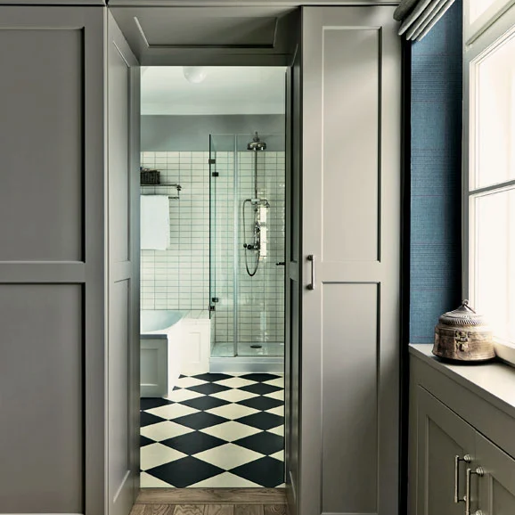
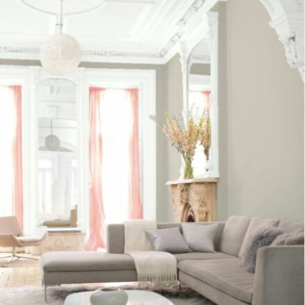
Shaded White | Farrow & Ball
Featuring the very best of light greige, Shaded White mixes together perfectly a light, airy cream with a subtle, muted grey. The result? You will want to use it again & again.
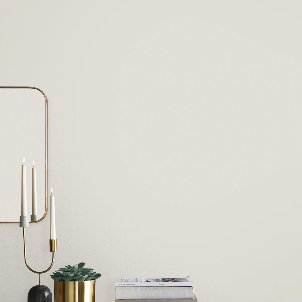
Design Tip: Pair with other muted colors, such as this muted blue-gray or this romantic gray-pink or to make your space feel bright and inviting.
Wrapping It Up
We know that there are thousands of greige colors available, but we hope that this list gives you some good ideas on which hue and brand works best for your style. Now, all that is left is to decide whether you’re going to play it safe (light greige) or take a chance (dark greige). The choice is up to you!
Related posts:
 17 Unique Appliances (From Small to Large) to Upgrade Your Kitchen
 Ecosa Pillow Review: Is It the Comfiest Pillow?
 14 Colors that Go Perfectly with Purple
 Minimalist Design Guide – 8 Ways to Infuse Minimalism Into Your Home
 16 Most Comfortable Blankets – Softest Blankets Out There
 31 Best Kitchen Gadgets That Are Cool & Useful
 13 Best Portland Home Stores to Shop Locally
 30 Gifts for the Home That Anyone Will Love
 26 Funny Coffee Table Books to Make Your Guests Chuckle
 35 Funny Coffee Mugs For Your Collection